
25 MAY - 08 JUNE 2021 | ~ 2.5 WEEKS
UNIQLO App Redesign
Reducing confusion & providing value for UNIQLO's customers & app users
Overview
This is an unsolicited project. I am not affiliated with/ do not work for/ nor am I paid for advertising UNIQLO. I am just an aspiring designer that loves UNIQLO and using their app as a personal case study to work on my craft.
Company Background
A global clothing apparel company founded in Japan with over 1000 stores around the world including 13 in the UK. While the company's main focus is the clothing goods, digital platforms including iOS and Android apps are also used and are the focus of this case study.
https://www.uniqlo.com/uk/en/company/
The purpose of the UNIQLO UK app
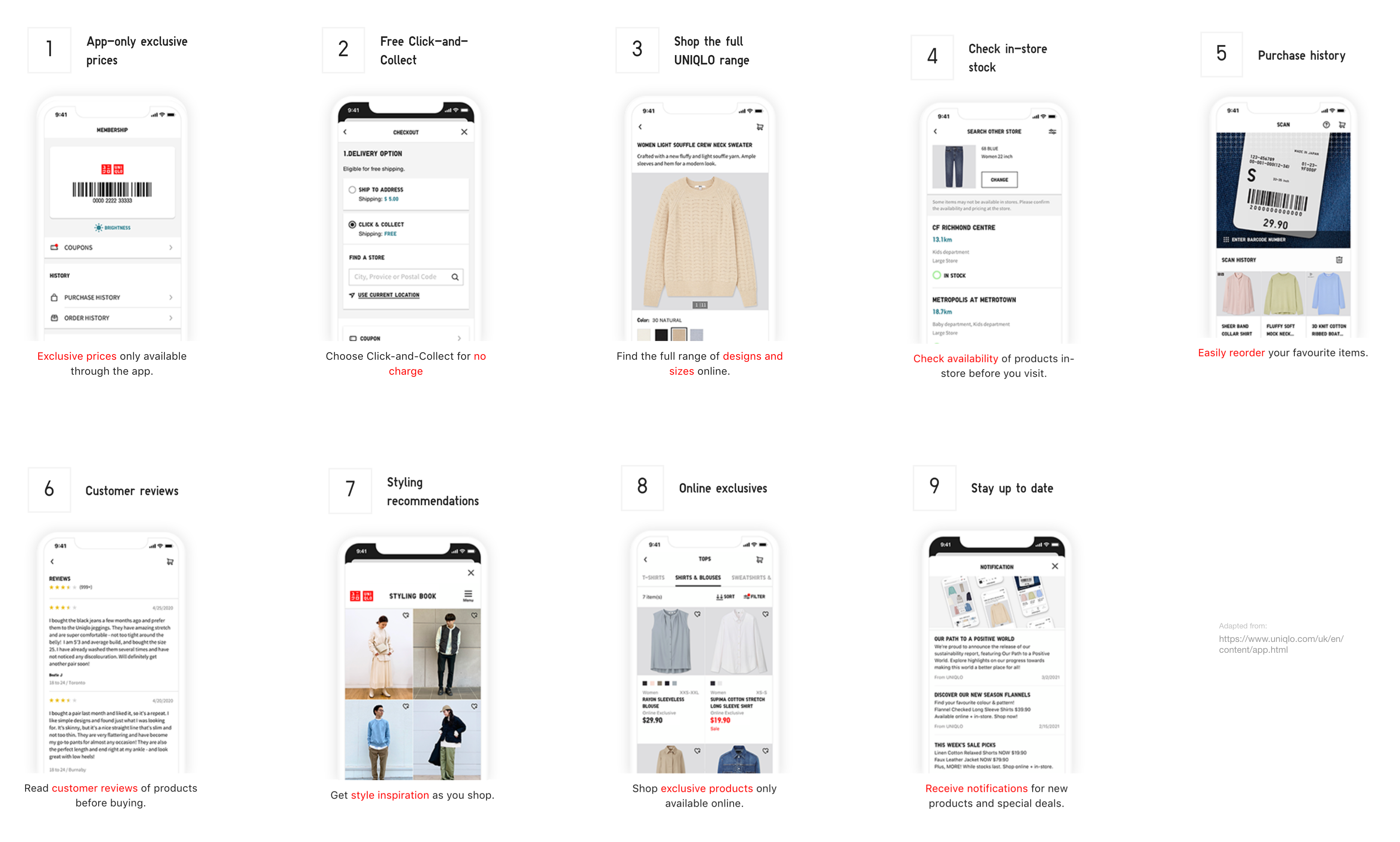
As mentioned on UNIQLO's website, the app was created to provide additional values to its customers , including exclusive prices and offers, shopping full range, purchase history etc.
However...
Users love the brand, but hate the app.
Love the brand
Hate the app
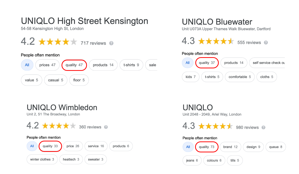
Based on the google reviews of the 13 stores in the UK, the main competitive advantage for the brand seems to be its quality products at an affordable price. However, this quality does not translate into their app.
Initial finding
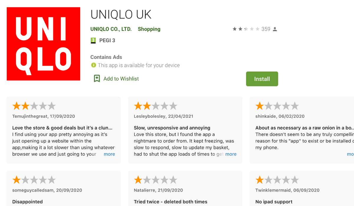
82% negative user experiences across iOS and Android apps.
Based on a total of 309 user reviews until 25 May 2021
Diving deeper
Why users hate the app?
To empathize and identify specific pain points and problems across the apps, I spent three days analysing the user reviews on their iOS and Android pages. Ideally, interviews or guerilla testing would have been a better alternative but did not have the budget or permission to carry it out as an unsolicited project.
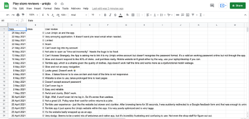
Preparing the user reviews
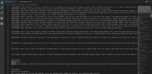
A total of 309 user reviews were collected across UNIQLO UK's iOS and Android apps. It was first copied to Google Docs, cleaned using VSCode editor, and later imported to Sheets to have a clean data source to analyze.
Mapping reviews into an experience map
Each user review was further broken down into individual points, where applicable. After multiple rounds of analysis, the clusters from the affinity map naturally led to an experience map of an average customer who is trying to use the app for the first time.
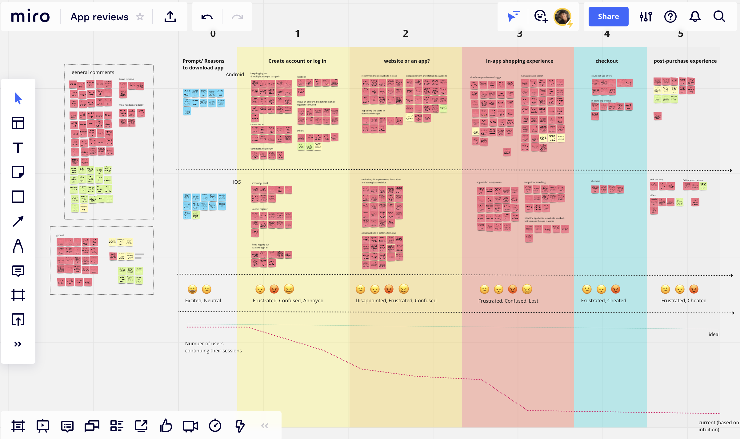
The majority of the pain points were identified in the early phases of the journey. I assume that as the user goes along the journey, more of them opt-out of the app.
Key findings
21% struggled with accessing their accounts.
22% confused whether it is an app or a website.
28% frustrated with the in-app shopping experience.
Based on a total of 389 pain points
Motivations for using the UNIQLO UK app
Although the majority of the reviews were negative, there were a few who mentioned that they still use the app to track their purchases and use the offer codes for discounts in-store... when it worked. In addition, there was also a considerable amount of comments on downloading the app to get early access to special collaborations and exclusive products.
GENERAL USER TRAITS
Love UNIQLO as a brand.
Bought UNIQLO products before.
Most opt out for shopping in the desktop website.
Scoping the problem
The rationale was to select a problem that required the least effort from the company while providing value for the users. Based on a mixture of personal experience, resources and user reviews, I decided to eliminate the confusion with the app and website.
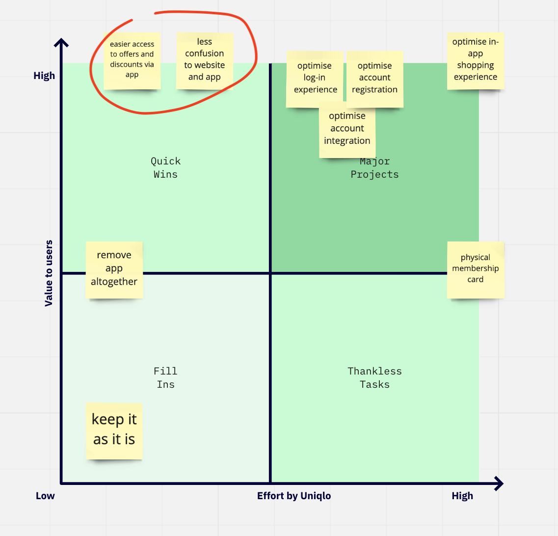
Moreover, problem areas such as the in-app shopping experience or the registration process were relatively complex and required stakeholders and technical information, which I had no access to.
EXPLORING THE PROBLEM
Is it an app or a website?
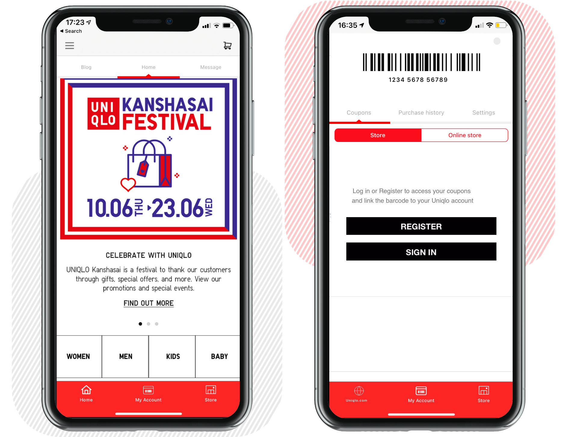
Before discussing solutions, let’s take a look at the problematic app and see how it can confuse even a tech-savvy user. Due to the identical implementation in iOS and Android platforms, I use the screens from the iOS versions going forward.
Confusing signifiers and inconsistencies
There are plenty of signifiers across the app that screams I am just a website poorly wrapped in an app. The most obvious signifiers are the bottom navigation and the top header bars.
Analysing all the screens and interaction flows in the app, 18 out of 26 interactions leads immediately to the web wrapper.
While this is not a deal-breaker if it worked, the problem is that it does not work. The web wrapper may not be as frustrating for some use cases, such as reading blog posts, but this only leads to frustration in terms of browsing or shopping. I suspect that the entire 28% of the negative in-app shopping experience and some account issues might also be a consequence of using the web wrapper.
HYPOTHESIS
Removing the web wrapper entirely will result in a more pleasant user experience with the likelihood of increased sales from mobile.
Proposed solution
Why remove the web wrapper?
A clearer mental model for the users
The reviews indicate that the users had expectations of an actual shopping experience when they downloaded the app. It would have been fine if the web wrapper worked, but it only led to more confusion and frustration. As a result, the only way people use the app currently is in-store to track their purchases and discounts.
It was also mentioned that several users opt-out to the desktop website to continue their shopping experience. Therefore, it might be viable to optimize the app for in-store experience, while focusing on the mobile website for the mobile shopping experience.
Using default mobile browser for shopping experience is feasible and perhaps more familiar
In the current app, if a user wants to browse or shop for products, the user flow involves opening the link in a wrapper and potentially opening it again in the user’s default browser. By removing the wrapper, there might be a higher chance that the user continues and completes their journey seamlessly in a browser that they trust and are familiar with.
Moreover, the default mobile browser also provides greater functionality such as cross-platform compatibilty, bookmarks, security, saved payment methods, etc. in case they want to continue on their desktop as frequently mentioned by the users.
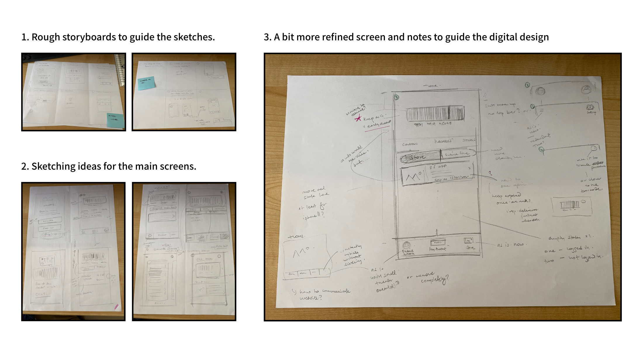
FIRST PROTOTYPE
A look at the potential redesign
Brainstorming ideas before going digital
The main rationale while sketching was to reduce signifiers that confused the user as to whether it was a website or an app.
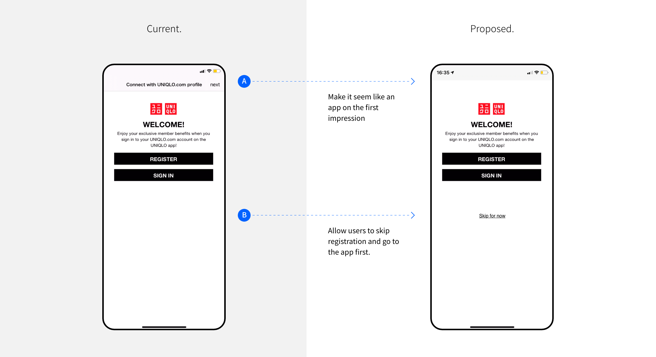
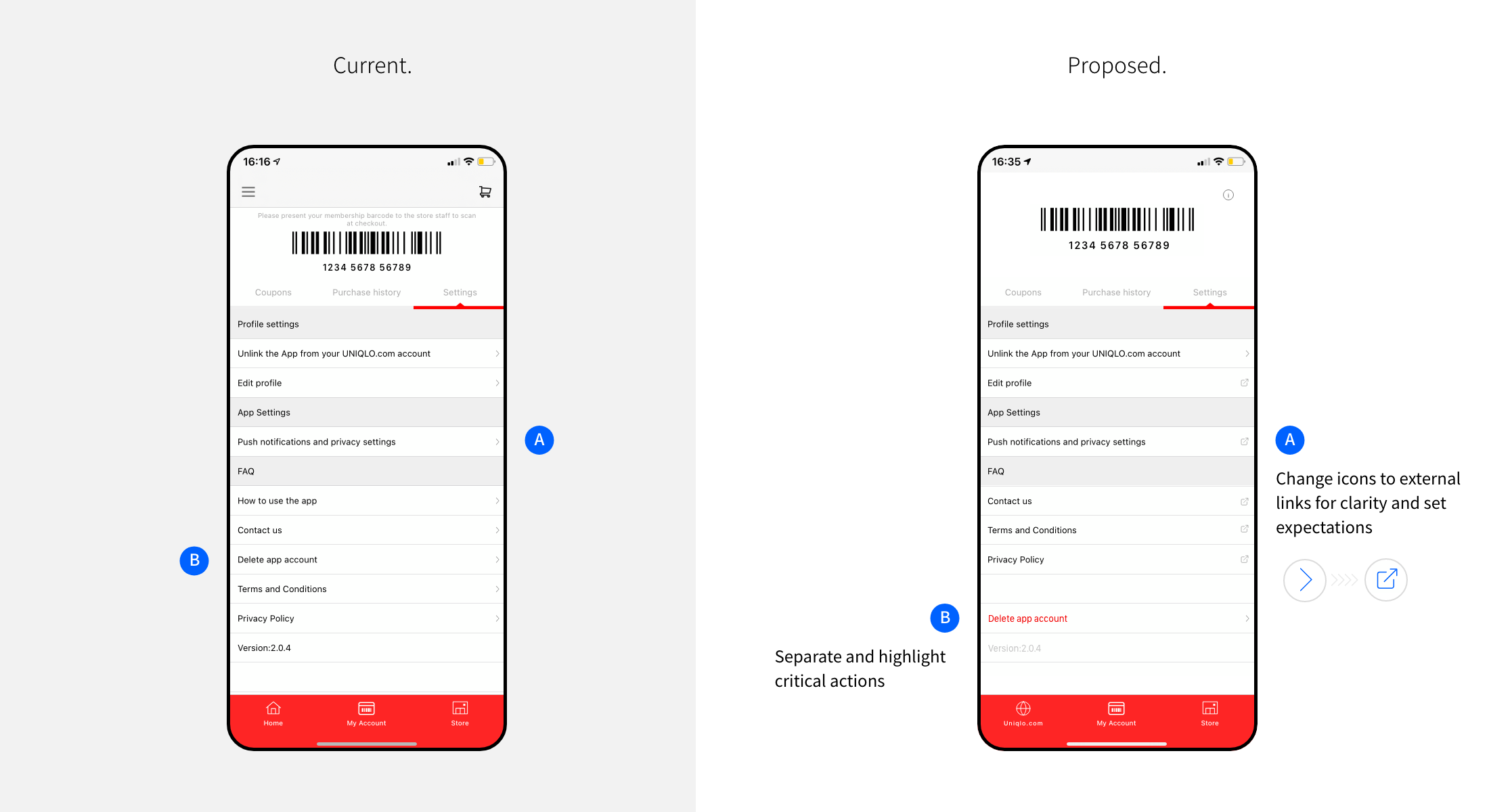
Proposed Change
An app on the first impression
The existing design starts off with a web-like interface and does not allow the user to proceed without logging in or registering.
Proposed Change
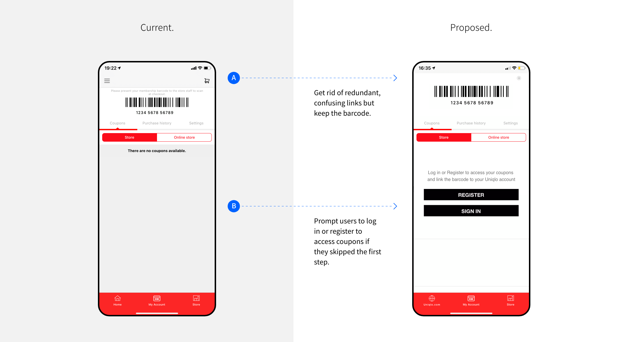
Refreshed 'my account' screen
The existing design redirects the users immediately to the mobile web version of their account upon registration. Instead, opening the app's my account screen seems more sensible. Plus, having it as the home screen instead of the promotional page might be more useful in future use cases.
Proposed Change
All links open in the user's default browser.
Initially, I wanted to remove this section, but thinking about the business goals, it might still serve some purpose and provide benefits to the user.
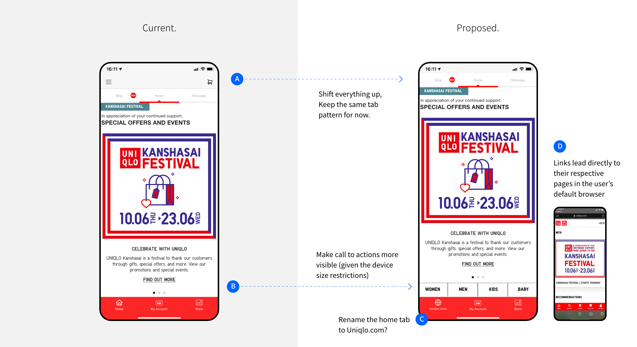
Proposed Change
Label with external link icon.
This small design change could potentially help signify to the user that it will lead to an external page.
Next steps
Validate the prototype with stakeholders and users. There were a few points that I stumbled on and needed more clarity, e.g. details of the app vs. account, the flow of the coupon usage, etc. Nevertheless, the new prototype should be good enough to test whether it still confuses the users as to whether its an app or a website and gather more insights for the next iteration.
Finish prototype, test and iterate the design for the in-store experience. Consult with the store employees and customers regarding their experience with the existing app and the prototype. In particular, the interaction between the two stakeholders at the counter. Ideally, with the intentions of comparing the two designs with metrics such as the number of errors, time to checkout, etc.
Improve the mobile website for the shopping experience. Based on personal analysis, I would say that information architecture requires a lot of work. In particular, special collaborations and collections seem to be popular among the existing customers (based on online communities and reviews), but this was difficult to discover via the current mobile website.
Potential returns
Increased usage and retention of app users
Increased sales from mobile devices
Better brand perception of UNIQLO
Other notes
A few additional insights and ideas which might be worth taking a second look at.
Using progress bars/skeleton loader for feedback while the users wait for the content to load. The current loader in the mobile website is quite limited and malfunctioning.
Prompting the users to log in only when required and communicating why they have to log in. Similarly, the registration form could be simplified to collect only the necessary information and ask users for other information when required.
I suspect that a device’s screen size causes some trouble with account integration. To be specific, I could not log in or access my account using my tablet at all. Some Android users also seemed to experience this issue, whom I suspect to use a tablet-sized device.
Reflections
Personally, the most interesting insight from the project was customer’s brand loyalty. In particular, there were frequent mentions of how they love UNIQLO despite hating the app. Plus, several users continue their shopping experience in the desktop browser rather than giving up altogether.
There were many times when I wished I had access to real data. I assume the number of installs to be high due to the voucher offer on their first download, but I wonder exactly how many users can actually materialize that offer? I also wonder how many users uninstall the app in the first few minutes? Moreover, is the UNIQLO app the same across the globe? If so, are there cultural differences, misalignment between the global teams, legislations, legacy systems, or other cross country constraints that might be causing problems? What is UNIQLO's vision for their mobile app - do they want their customers to order from it or just use it as an addition to their in-store experience?
In terms of the process, I believe the initial effort to collect and organize the reviews was worthwhile since it allowed me to calculate the numbers and helped me when I had to revisit the data numerous times to cross reference or reorganize the post-its. This repetition helped me to empathize more with the users and observe interesting patterns, which I missed previously.