
25 JULY - 25 AUGUST 2021 | ~ 1 MONTH
Money Dashboard Neon Redesign
Increasing scalability and reducing the cognitive load of budget app users while creating a custom category.
Overview
- Understanding the context & problem space
- Exploring a specific opportunity
- Potential solutions & returns
This is an unsolicited project. I am not affiliated with/ do not work for/ nor am I paid for advertising Money Dashboard. I am only using their product for learning purposes and to work on my craft.
WHAT IS MONEY DASHBOARD NEON?
A personal budgeting app that will help you discover where your money is going, start saving and plan for the future - for free.
https://www.moneydashboard.com/
building context & empathy
Understanding the problem domain
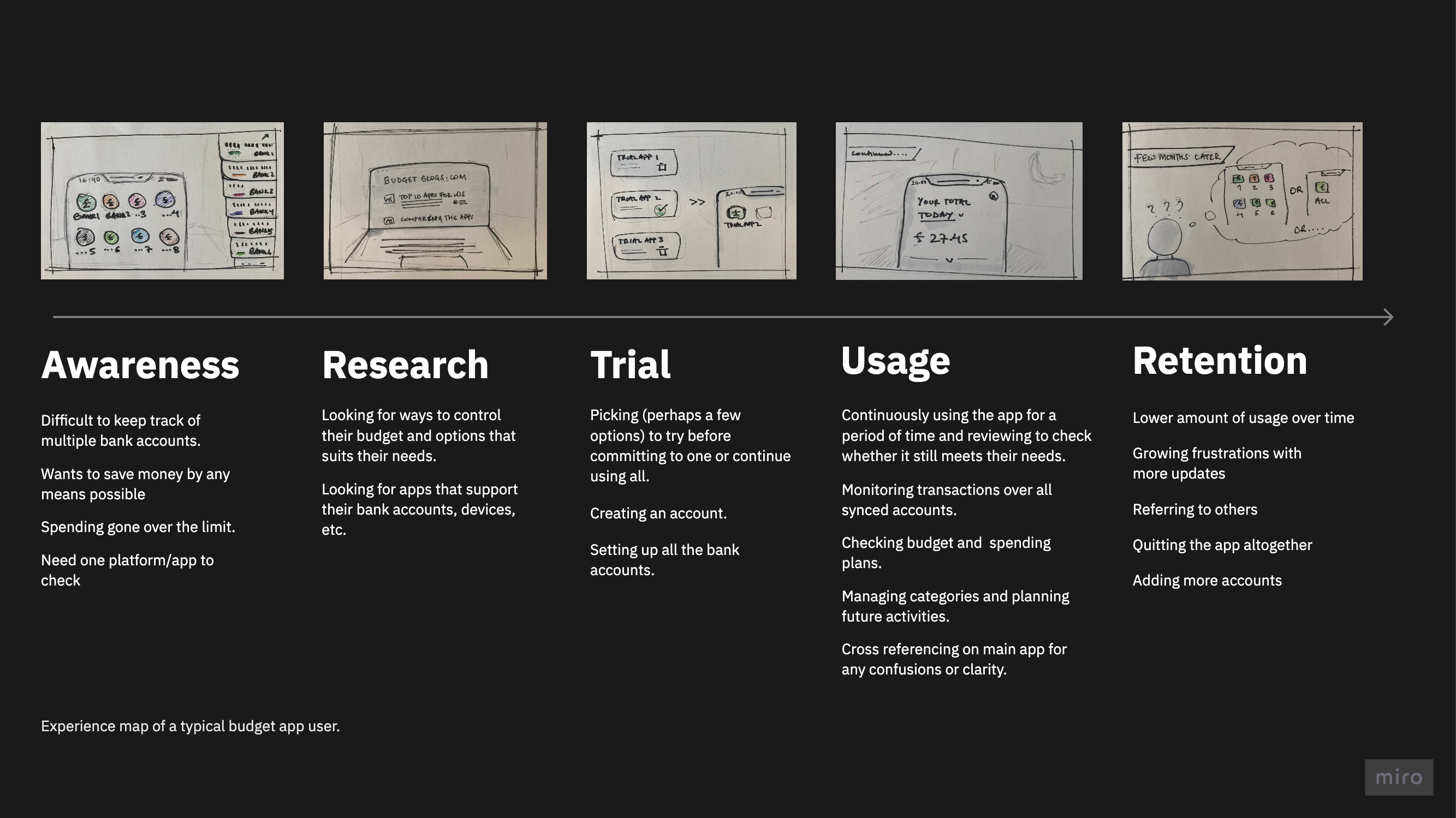
As an unfamiliar problem space, I had to spend relatively more time to get a better understanding of the problem domain and how users keep track of all their personal incomes and expenses.
Using existing company data, user reviews and external resources to understand the company's goals & empathize with the users
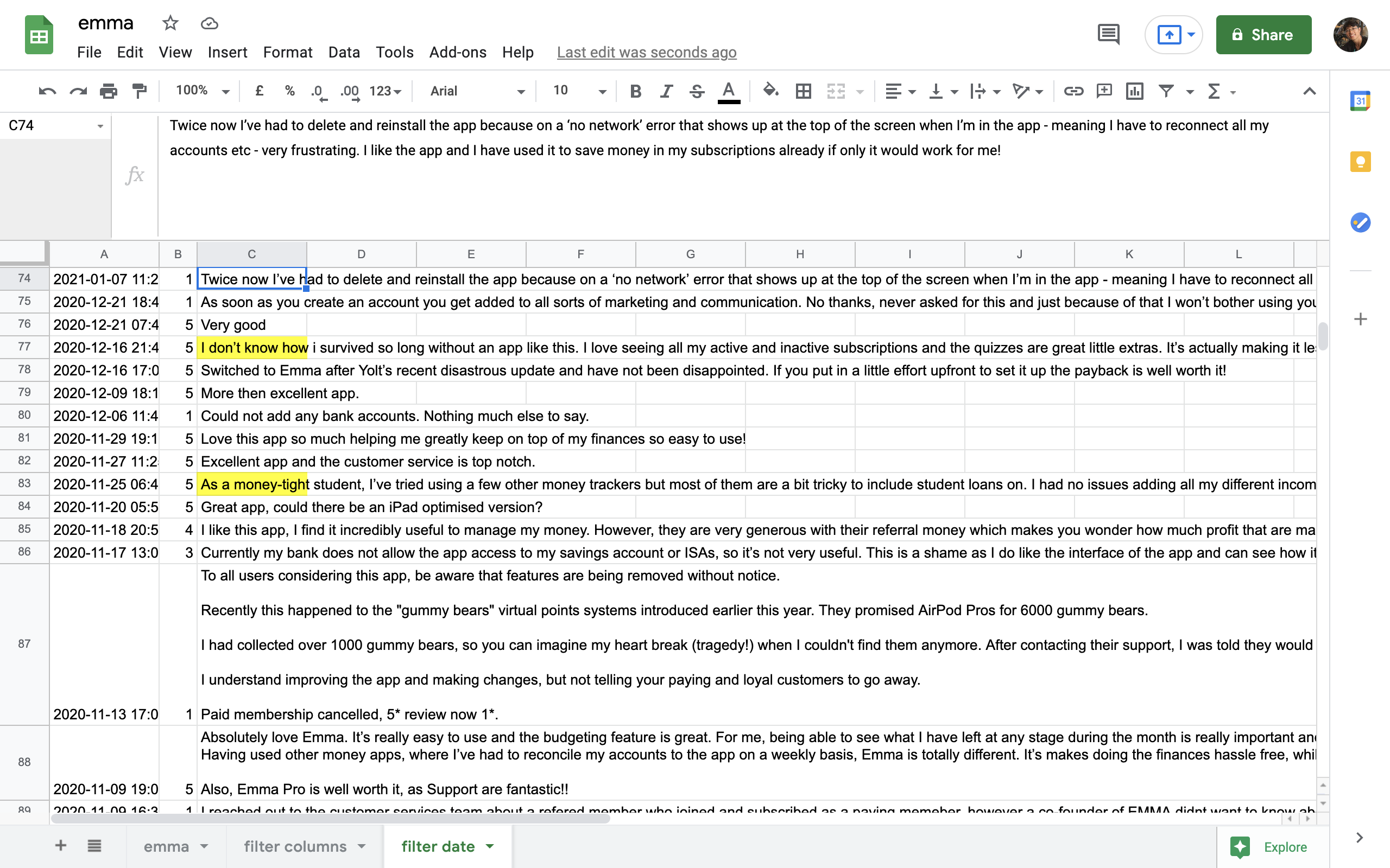
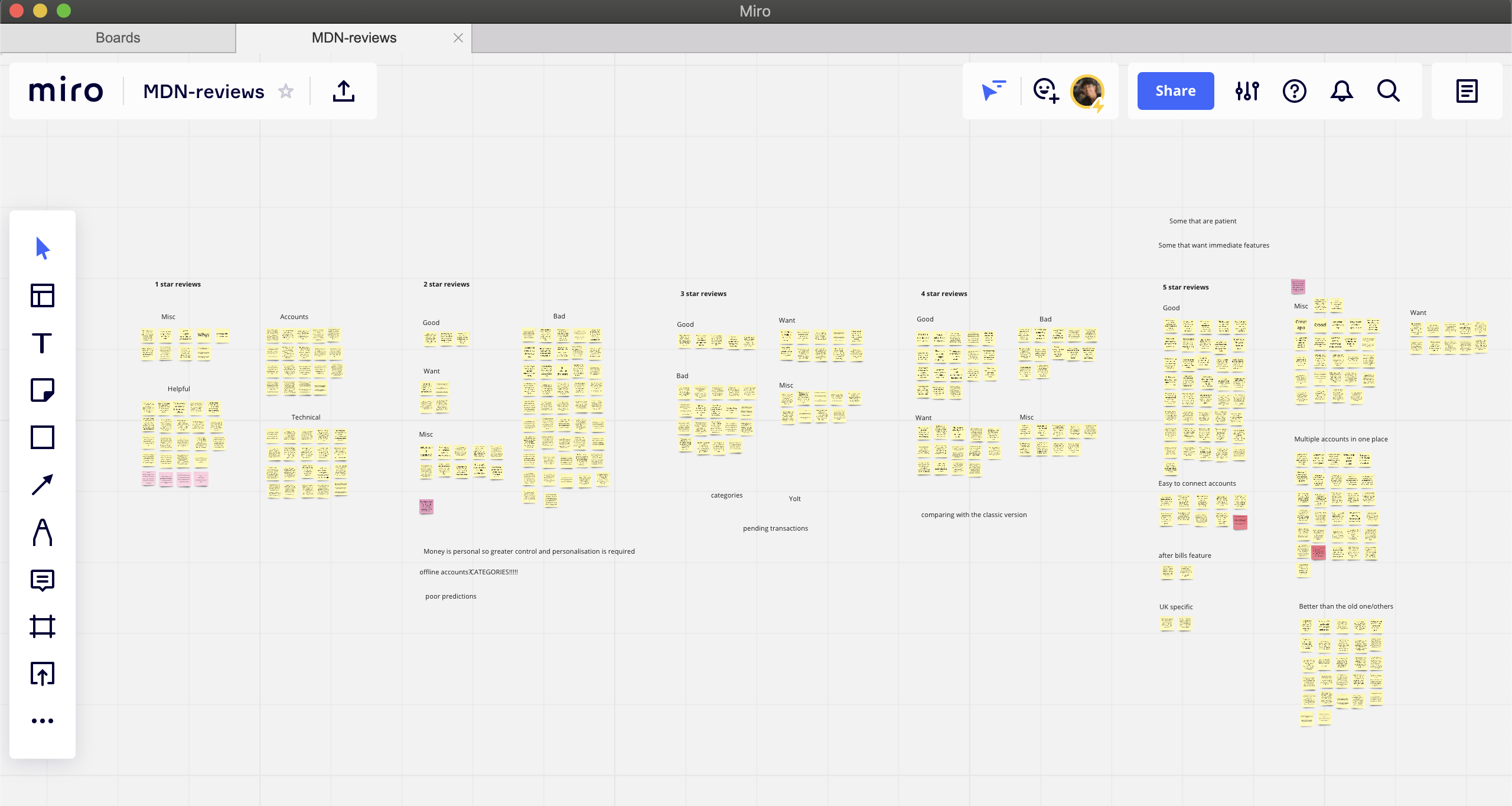
While conducting affinity mapping with Neon user reviews (268), the Neon app was frequently compared to three other apps - Yolt, Emma and Classic*. Thus, it made sense to consider these apps to discover general user needs and frustrations in the problem domain. Therefore, a total of 1531 user reviews were studied.
*Classic is the predecessor of the Neon version from Money Dashboard.
General user traits
Own multiple bank accounts.
Tech-savvy.
Pragmatic and analytical.
Potentially using the Classic version of the app as well.
General user needs
Needs to support their bank.
Reliable and accurate.
Privacy and security are prioritised due to sensitive data.
Needs customisation to match their personal spending habit.
Scoping the problems and opportunities based on potential user value and effort from the company
A recurring theme across the user reviews was categories, which is understandable given the need of the users to view and track their income and expenses in an ordered and organised manner.
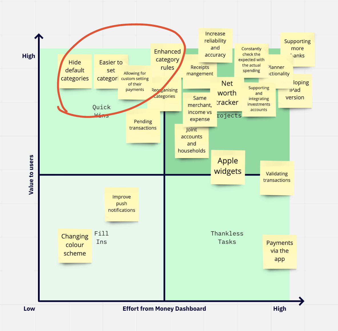
Another factor for exploring categories was Money Dashboard's business model of user insights and behaviour. Therefore, an easier method to categorise and view an overview of user spending might reflect a more accurate user behaviour, which would lead to unique discoveries and insights for the future.
DIVING DEEPER AT THE OPPORTUNITY
A closer look at everything categories
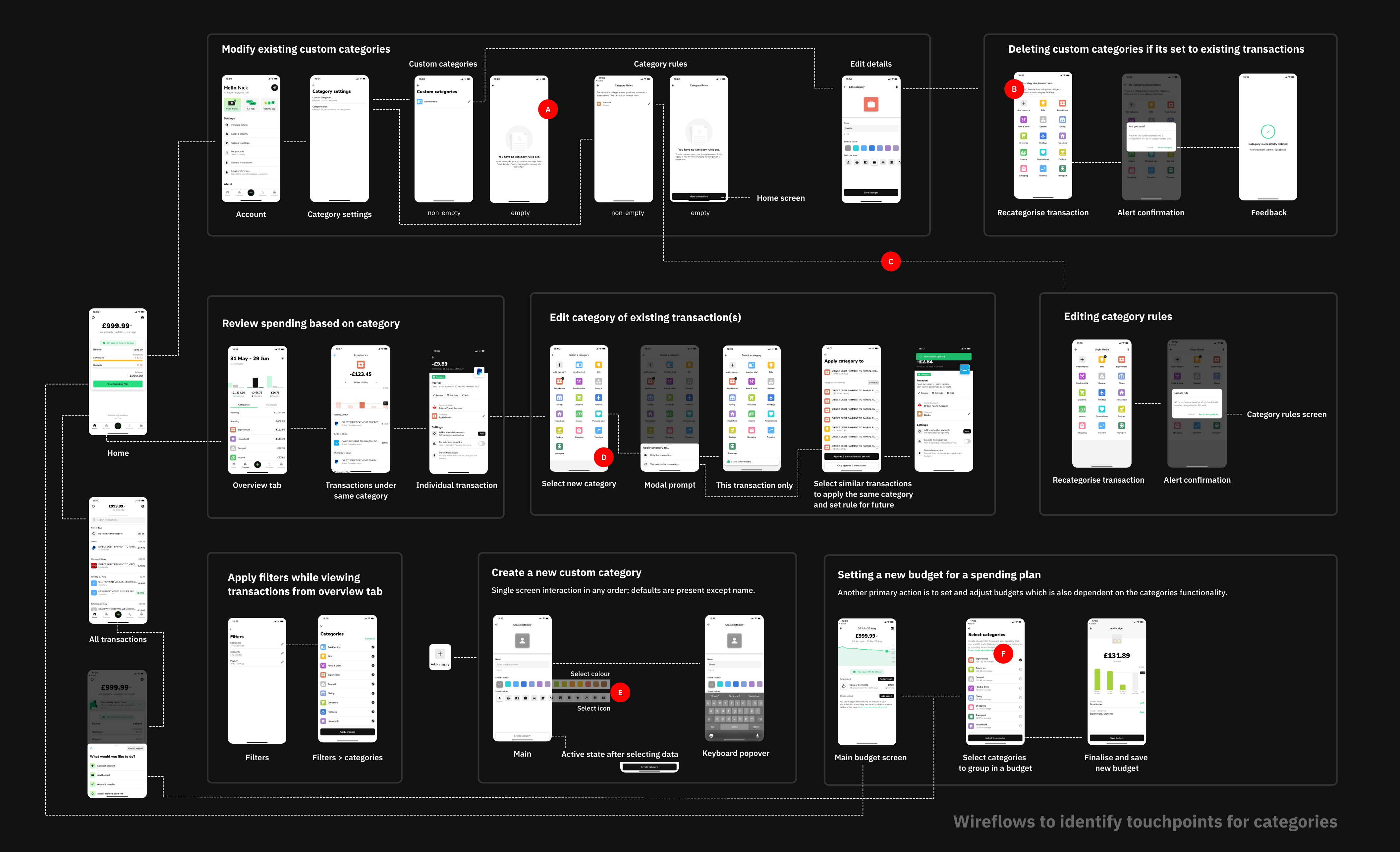
A closer look at how people assign and engage with categories across the whole product. This exercise was also helpful in getting familiar with the design patterns, systems and constraints of the ecosystem.
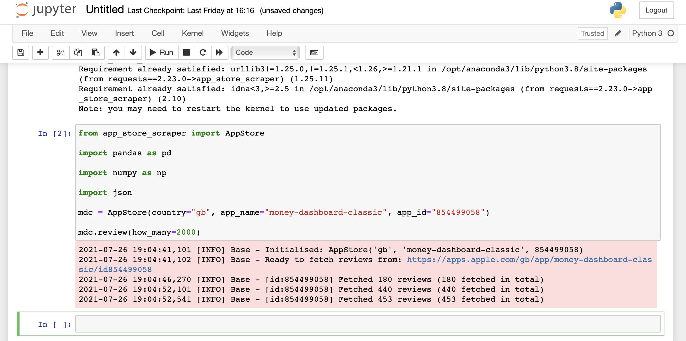
At present, individual transactions are assigned automatically to one of the 14 default categories via a machine learning algorithm. This case study concerns the cases where the user has to create a custom category that does not fit the existing default categories.
Wireflow to identify the touchpoints and activities where a user might engage with categories
Plotting and prioritising opportunities
Based on the previous research and experience with the app, I identified and plotted opportunities that might be valuable to the user and the company.
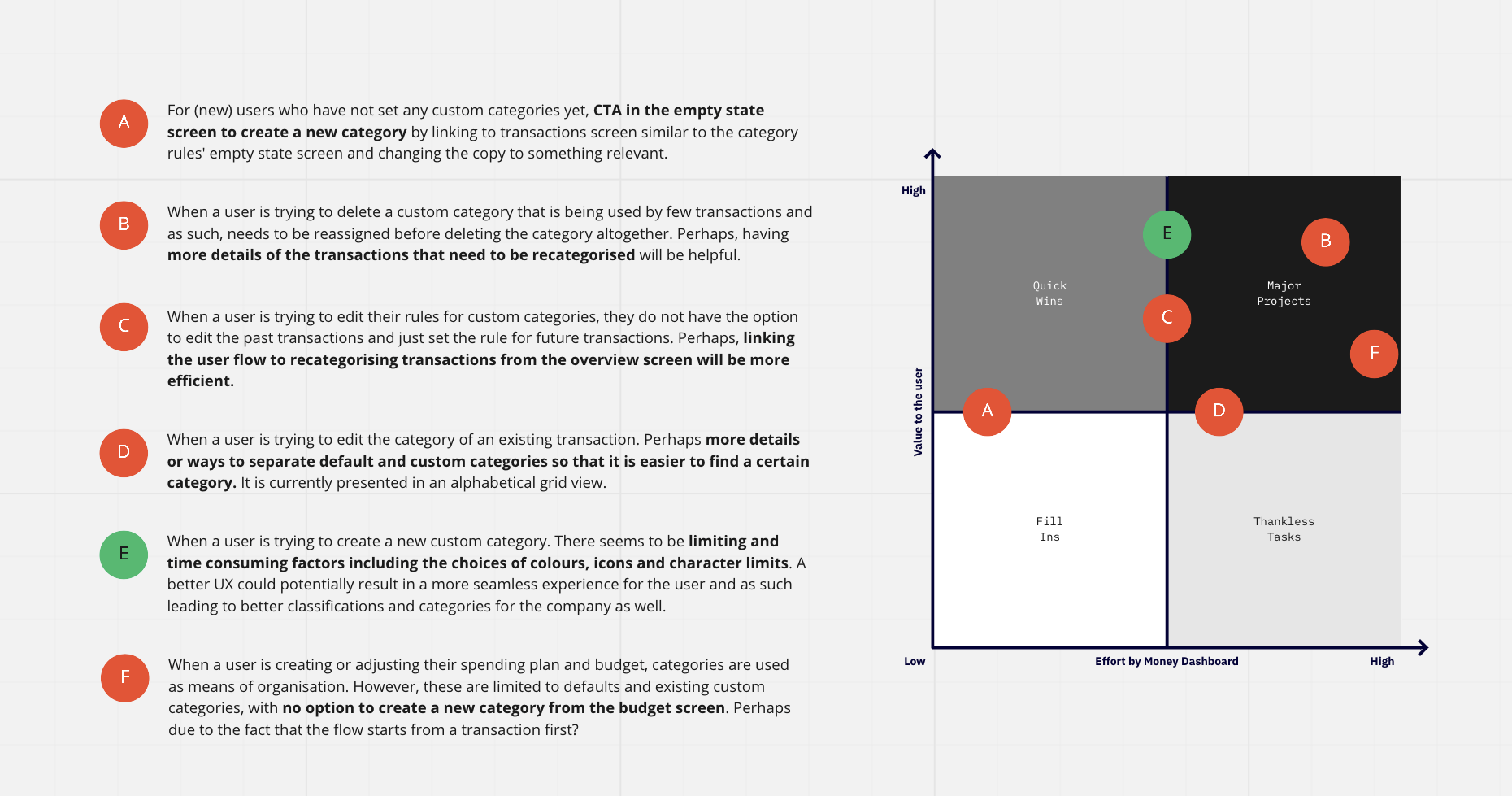
OPPORTUNITY STATEMENT
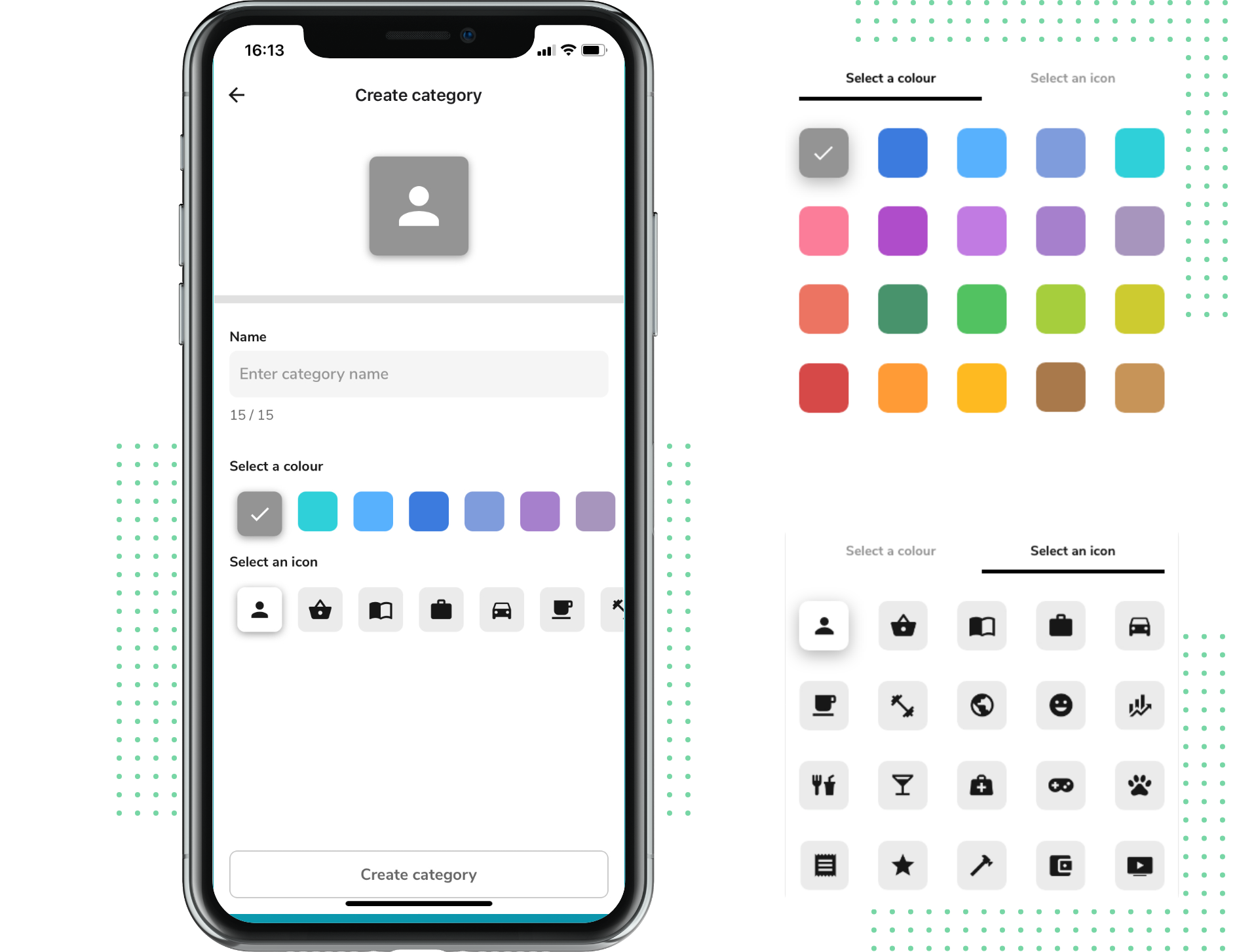
There is an opportunity to reduce the user's cognitive load and gather more accurate data and insights for the company. The process to create a new custom category presents a sub-optimal UX, especially while choosing icons and colours. This results in an additional cognitive effort and time for users who most likely compromise with the defaults.
EXPLORING THE OPPORTUNITY
Redesigning the experience of creating a new custom category
Brainstorming ideas in lo-fi for alternative layouts, flows, sequences, etc.
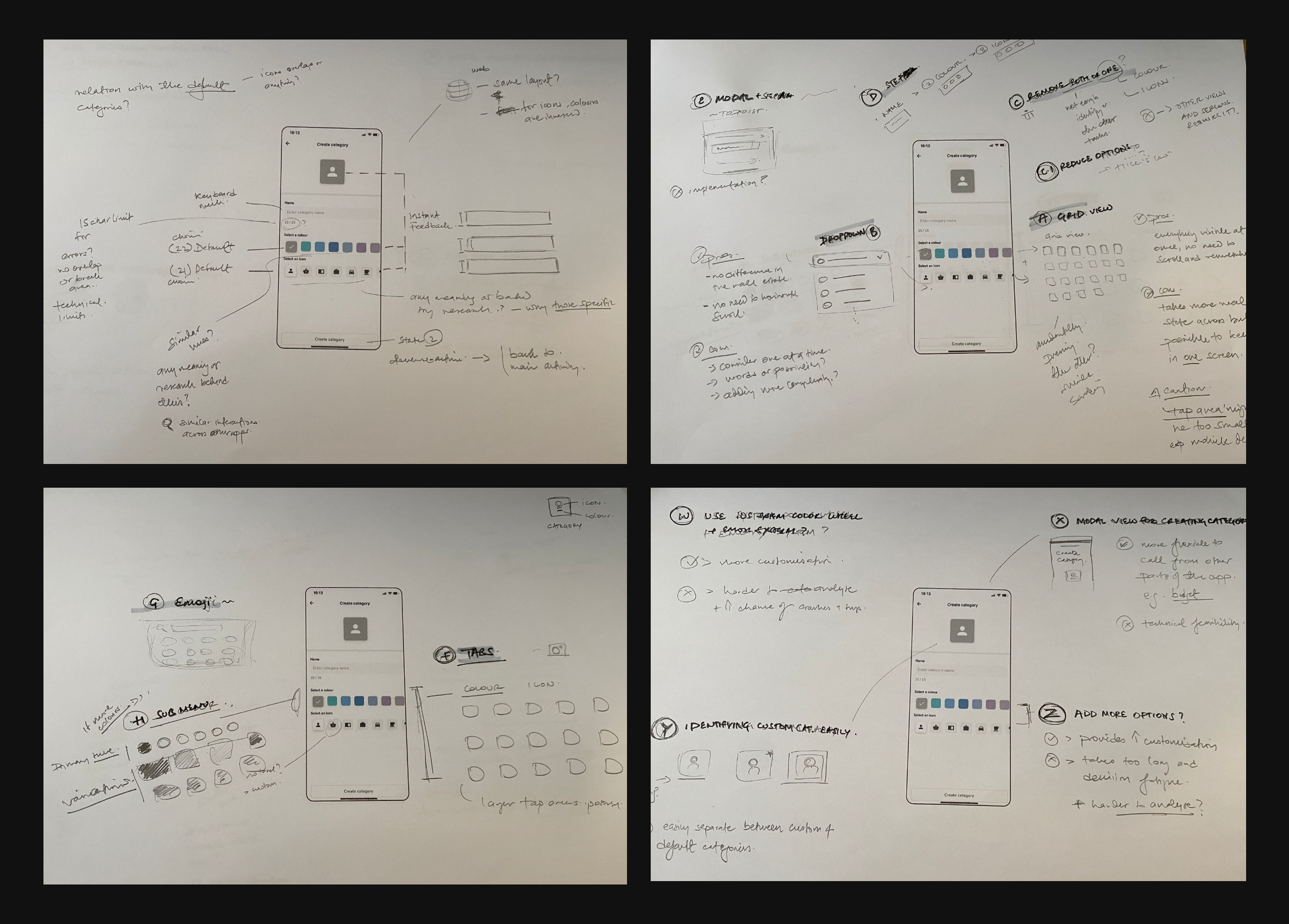
Plotting ideas based on value, impact and effort
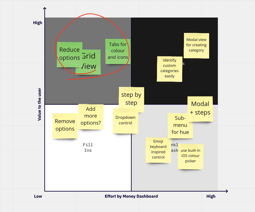
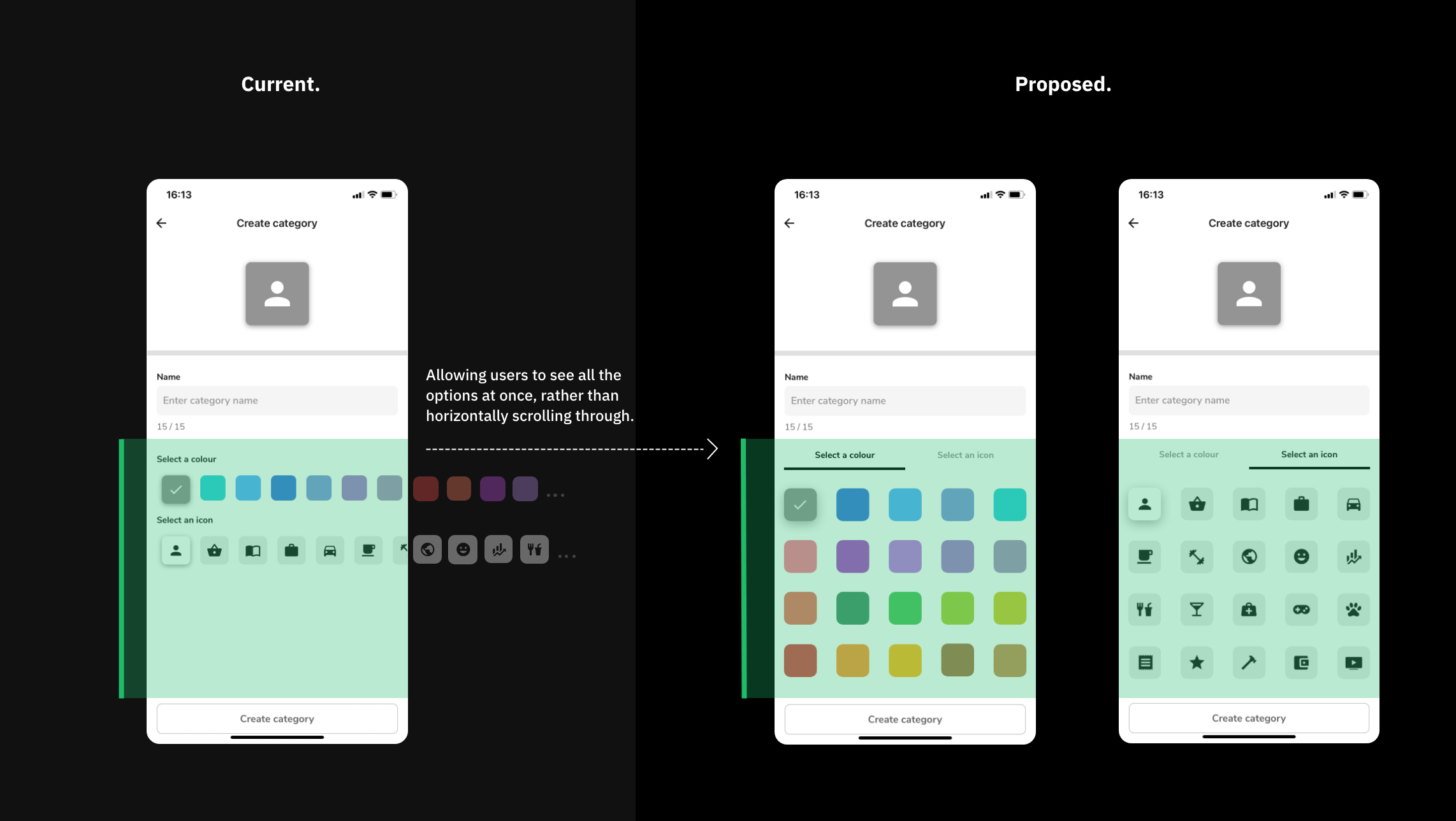
The proposed solution
Same idea, different execution
PROPOSED SOLUTION
Less cognitive load while choosing colours and icons
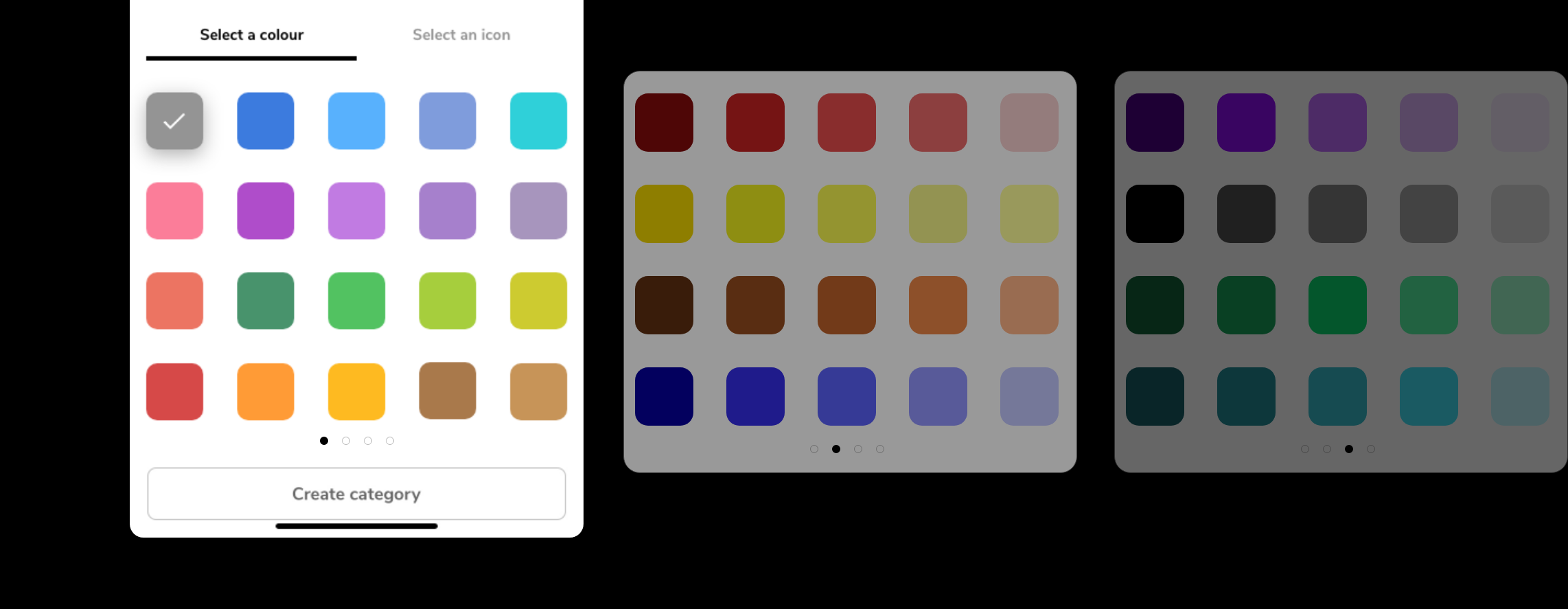
After considering several options, the most feasible and effective solution seemed to be a simple change in the presentation of the options for colours and icons. The new layout presents a reduced selection of 20 options at a glance, which would reduce the user's cognitive load and enable the user to weigh the available options and choose the most suitable one immediately.
Proposed solution
Designed for scalability
If there is a need to add more options for colours and icons , the new layout should be a better alternative than the current offering, where adding more options to the horizontal scroll will only increase the cognitive load.
Potential returns
Higher engagement and satisfaction while creating custom categories
Increase scalability for offering more customisation in the future
More reliable usage data and insight for the company
Reduce cognitive load while creating custom categories
Next steps
Validate the choices of colours and icons with stakeholders as well as the feasibility for implementation, then validate and iterate with the users. An A/B test can be conducted where users are asked to create a set of custom categories and the time taken can be used as a metric to compare along with a post-test interview to measure the effectiveness and satisfaction.
Reflections
Personally, the most challenging aspect was to scope the project into a concise case study that was interesting and sensible for a reader. A few alternative opportunities might have been more compelling but required knowledge and stakeholder expertise that I had no access to. Nevertheless, this was a good learning experience to practice my product design skills in an unfamiliar domain.